

September 13, 2026
REFERENCES, BRAND SYSTEMS, AND CONSISTENT IMAGE FAMILIES
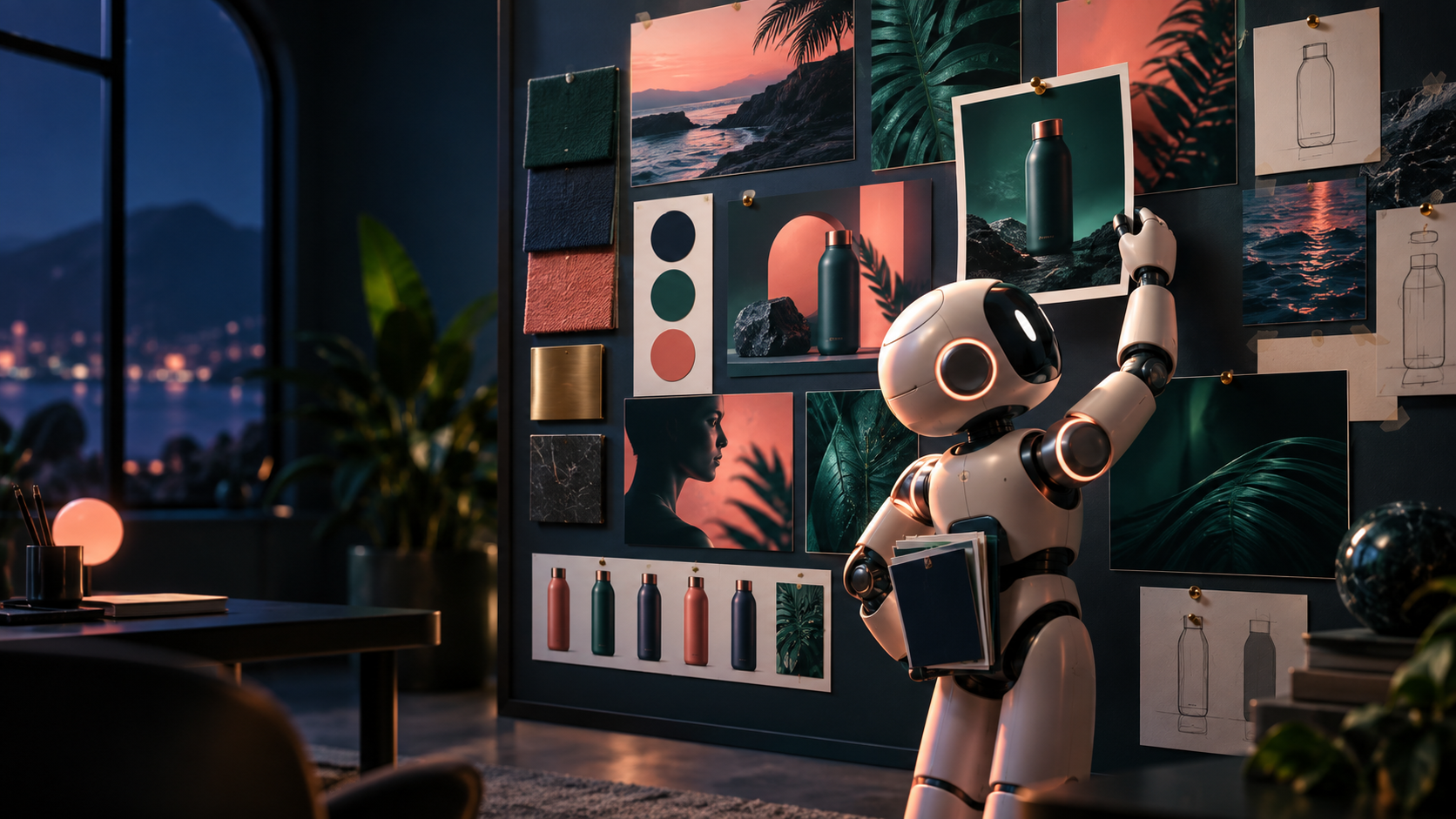
One good image is luck. Five images that clearly belong together is a system. Clients, students, and shoppers all read inconsistency as untrustworthiness — the bakery whose five "product photos" show five different loaves, or the course whose heroes change palette every lesson.
References beat style labels
"Make it cinematic" means nothing executable. A reference image shows composition, lighting, palette, wardrobe, product treatment, and visual grammar in one glance — more reliably than any adjective stack.
Use three kinds of references deliberately:
- Composition reference: the layout to hold (subject right, copy left; top-down flat-lay; centered product on seamless).
- Lighting / palette reference: the look to hold (soft morning side-light; navy/green/red editorial geometry).
- Product / character reference: the truth to hold (this exact loaf, this mascot's proportions, this label).
Attach one reference per job in the tool (most engines from Lesson 57.3 accept image input) and name in the direction what the reference controls: "hold the loaf shape and crust color from the reference; reinterpret the background per the brief." What you do not name, the model feels free to reinvent.
Build a tiny library as you go: references/composition/, references/lighting/, references/product/. Future lessons — and future you — will thank present you.
The five terms
- Brand system: the full set of locked decisions — colors, type, imagery rules, voice, do-not-use list.
- Visual language: how the brand *looks* in practice (geometric editorial, warm documentary photo, minimal 3D).
- Reusable prompt block: a pasted direction paragraph encoding the locked decisions, reused verbatim across generations.
- Style guide: the written document (your VISUAL-SYSTEM.md) explaining the decisions and their boundaries.
- Asset library: the stored files — references, prompt blocks, approved masters — anyone on the project can reuse.
The prompt block is the workhorse. Write it once from a winning exploration (57.2), then paste it unchanged into every new generation, changing only the subject line. Consistency comes from repetition of the same words, not from hoping the model "remembers the vibe."
Inspired by versus copying: describe qualities, don't borrow names
The practical rule: describe the visual qualities you need rather than borrowing a living artist's name or a brand's protected identity as a shortcut.
"Inspired by a genre" is fine: "flat editorial vector illustration, geometric shapes, generous negative space, limited three-color palette." That describes qualities anyone can execute. Typing a living illustrator's name to extract their identifiable hand, or a brand's campaign look to pass as that brand, is a different act — it free-rides on someone's protected work and teaches the model (and you) nothing transferable.
Operational test: could you achieve the result without the name? If yes, drop the name and keep the description — your prompt block just became durable and defensible. If no, you are borrowing identity, not direction. Choose a different direction or license the real thing. This is the Part XIII production rule on likeness and rights, applied to style: permission, license, original asset, or a different creative direction.
The consistency kit
Every project gets these seven locks before generating the family:
1. Color values: hex codes, not "blue-ish." ByeBuy Classroom: navy #0F2439, deep green #1E5B4A, restrained red #C73E2E, off-white #F4F1EA. Maximum one red element per image. 2. Materials: surfaces that recur (matte paper, brushed wood, soft gradient mesh — pick two, ban the rest). 3. Camera feel: one default (eye-level medium-wide, subtle depth of field) plus named exceptions. 4. Background rules: what sits behind the subject (dark navy geometry; blurred shop interior; plain warm seamless — never a new world per image). 5. Typography handled outside the image: real words live in HTML, captions, or the editor — not baked into pixels — except when the benchmark explicitly requires rendered text. Keeps spelling, localization, and accessibility fixable. 6. Character / product rules: the truths that never drift (loaf shape and scoring pattern; mascot proportions; label text from the reference photo, verified per output). 7. Do-not-use list: banned moves (no photorealistic faces, no neon gradients, no extra pastries, no competitor logos, no tiny illegible text).
Write the kit once; enforce it at review (57.5) with the same words.
The local-launch test: five images, one campaign
The bakery needs five: storefront card, hero loaf, morning-ritual process shot, baker portrait (real person, permission on file), and a vertical ad. Without a kit, five generations produce five bakeries. With the kit — same prompt block, same palette, same background rule, same product reference — they read as one morning in one shop.
Check side by side at thumbnail size: do the greens match? Do the backgrounds share depth? Does the loaf stay the loaf? Thumbnails expose drift that full-screen viewing hides.
Exercise: VISUAL-SYSTEM.md + board + three-image family
Create for your Classroom, launch, or research project:
# VISUAL-SYSTEM.md — [project]
## Locked decisions
- Palette (hex): ...
- Materials:
- Camera default:
- Background rule:
- Type rule: (outside image except ___)
- Character/product truths:
- Do-not-use list:
## REUSABLE PROMPT BLOCK (paste verbatim)
[one paragraph encoding the above: style, palette, lighting, camera, composition default, exclusions]
## Reference board
- composition: references/composition/___ (controls ___)
- lighting/palette: references/lighting/___ (controls ___)
- product/character: references/product/___ (controls ___)
Then generate three images using the identical prompt block, changing only the subject line (e.g., three Classroom heroes for three lessons, or loaf / process / storefront). Save them as family-01/02/03.png beside the board.
Finish line: a VISUAL-SYSTEM.md, a small reference board, and a three-image family that passes the side-by-side check: same palette, same camera feel, same background logic, product/character intact.
Verify fast: shrink all three to thumbnails and show them to someone cold. Ask "same brand?" If they hesitate, name the drifting dimension (usually background or palette) and regenerate the outlier with the block pasted exactly. Common failure: tweaking the prompt block per image "for variety." Variety belongs in the subject line; the block stays frozen.
Check your understanding
1. Why does a reference communicate more reliably than a style label? Give an example. 2. What is the difference between a style guide and a reusable prompt block? 3. Rewrite "in the style of [living artist]" as a qualities-only description. 4. Which of the seven kit locks most often causes a family to fail, in your test?
Next
Consistent families in hand. Next, Lesson 57.5 closes the class: the review that separates dramatic from usable, the right medium per claim, alt text, and the DELIVERY-PACK/ that makes an image publishable.
ARTICLE DISCUSSION
JOIN THE
CONVERSATION.
Got a question, a take, or a better way to do this? Log in and leave a comment.